E-Commerce site structure and elements
Each section of a traditional eCommerce website has specific elements, expectations, and purposes. Most websites have similar structural elements and workflow that users have come to expect. E-Commerce sites often draw on aspects of traditional retail stores by using the brick and mortar symbols of checkouts and shopping carts. Stating that a shopper is “adding something to their cart” fits with how customers have traditionally thought about the shopping experience. They understand the analogy of a shopping cart or checkout line and quickly learn that adding an item to the “cart” does not mean the purchase is finalized but that “checking out” will complete the payment and purchase, in the same way it would at the store down the street. Understanding what people expect online as well as what they expect when shopping, in general, will help retailers create a better eCommerce experience as well as increase the chance that the customer will be loyal and happy.
Template / Theme
● Header
● Footer
● Colors
● Fonts
● Page header banners
● Side navigation
Pages
● Home
● Category List
● Product List
● Product Detail Page
● Shopping Cart
● Checkout
● My Account
● Static
Off Site
● Review sites
● Social media sites
● Articles
Website Structure / Template
The website template consists of a header, footer, and a few other elements that are on all or most of the site’s pages. It could also include colors, fonts, and other design elements.
Templates provide a consistent shopping experience and design that fits the brand message.
Keeping aspects of your site consistent will allow users to feel safe while navigating and exploring. It is often useful to follow conventional template structures found on other eCommerce websites. Shoppers are familiar with how to shop online and trying to create new interfaces can be confusing.
The template also provides a look and feel that fits the brand message. The colors, fonts, and photos used on sites for dolls, skateboards or insurance would be very different. The design elements, use of language and theme of the site needs to consistently tell your brand story, whether it is fun, excitement or safety.
Main Elements:
● Header
● Footer
● Navigation
● Theme / Colors / Fonts
Website Structure / Template / Header
The header is the first thing people see on your site and it must pack a lot of information into a small space. Headers often contain the logo, search bar, product and site navigation, shopping cart information, promos and contact information.
Main goals of a header:
● Provide consistency for the web experience
● Provide general site and user information
● Provide site navigation and product search
Logo:
The logo is often on the left side of each page, but is also popular in the center of the page as well on responsive design sites. The logo generally links to the home page and is an easy anchor to assure people they are able to go back to the home page anytime they want. I believe the logo has traditionally been on the left because people in the West generally read from left to right. A logo oriented on the left has the added benefit that no matter how small the browser window, the logo will always be visible and visitors will know what site the browser window is displaying. This is becoming less important with responsive design sites because the logo would always stay visible.
Search:
The primary use for search capabilities on a website is to help people discover products, especially if the retailer has a large catalog of items for sale.
Search becomes more important as you add more products to your store.
The interface designer should look at how important search is to the specific target audience and the catalog of products on the site. If search is important, enlarging the search box plays at least two important roles. It makes finding the search bar easy and shows the user that you expect them to use it. By making the search bar prominent, the designer is telling the user that this is the easiest way for them to find the desired product.
Search features can show autocomplete suggestions as you type, show products right in the search box, allow searches by uploading photos and even add items to the cart in the search box.
Contact Information:
Contact information should be available on all eCommerce sites, but placing it in the header is an effective way to make it easy to find and ensure that it is on every page.
Clear contact information shows the online shopper that if they have a problem, someone is available to help them. As with the search box, a larger phone number gives the appearance that phone calls are encouraged for any reason. Other forms of contact info include a physical store locator for retailers with a brick and mortar presence, hours of operation, links to online forms such as large quote requests or general questions, email addresses, the headquarters address, social media links and live chat.
Communicate with customers in the manner that works best for them.
Retailers may only want to encourage certain types of communication and by making this information larger, prominent, and placing it in the header, more people will be encouraged to use the preferred method.
Shopping Cart Information
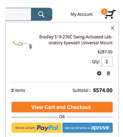
The shopping cart icon informs the user how many products they have in their cart. It can also include a drop-down menu on mouse-over with an image, quantity, name, and price of each item about to purchase. Putting this information in the header saves shoppers the hassle of going to the shopping cart page to view what they have in their cart while shopping.

Site-Wide Promos
Free shipping, special sales, and other promotions or information are great items to put in the header. This ensures that people are able to see the information. However, adding too many promotions will clutter the site and render each promo less effective.
 Navigation
Top-level product category navigation can be useful for a number of reasons.
If the site is not well-known, top-level navigation tells new users the types of products you sell.
It also helps people that prefer navigation over searching to find what they are looking for quickly. Some sites directly list the top categories and other sites have a drop-down menu listing top categories.
Many eCommerce stores also include navigation that is not product-focused. About, Contact, Legal and Login links are also commonly put in the header.
Website Structure / Home Page:
The home page, unlike many other pages, serves a number of distinct purposes that depend on the type and popularity of the site. Walmart does not need to explain what they sell while hayneedle.com may need to. Placing the UVP (unique value proposition) on Walmart’s home page is not as important as placing it on the home page of a website that is less popular. Some stores feature products on the home page while others use it to help customers find the right category. Some stores expect the home page to be the starting place for the shopping experience while others assume the shopping experience starts with a Google search and customers enter their site through a category or product detail page.
Each website has a different purpose for the home page that is influenced by brand recognition, discovery norms and depth of their catalog.
Main goals:
Make visitors aware of what the site sells and its unique value proposition.
Help customers find what they want with as little effort as possible.
Main Elements:
Unlike most of the pages of an eCommerce website, home pages can be vastly different from one store to another with incredibly different goals. The execution of the site’s goals can also vary dramatically depending on many factors.
● Banner displaying UVP or product and category
● Featured brands
● Trust signals
● Featured categories or products
● Extensive list of popular products or categories
Website Structure / Category List Page:
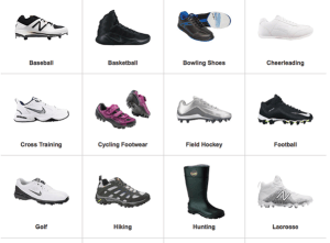
Category list pages are common on sites with a larger product catalog. They display the subcategories making it easier for users to find the items they are looking for. Athletic shoe stores may display a list of shoes such as running, basketball, soccer, and baseball but not a list of specific shoes. Physical stores have aisles dedicated to specific sections that can be seen from the entrance. Shoppers do not expect to see the specific shoes they are looking for before visiting the shoe section and the specific shelf where those shoes are located. The same can be said for online stores.
Main Goals:
●Show the types of products for sale on the site.
● Move shoppers closer to the products they are looking for.
Main Elements:
● Multiple product categories
● Links to related content
Calls to Action:
● Links to subcategories
● Links to related content
Some stores have additional information such as links to buying guides, product comparisons, or other product-related information. This can be very helpful if the shopper needs assistance in making a decision.
Category pages may also list top-selling products. This feature is effective when it helps the buyer find the product they want faster, especially if they know want they want. If the category includes many products, but only a few popular items, displaying the popular products as early as possible in the process can be very effective. This feature can also serve as a social signal that indicates which products are the best deal or value.
Website Structure / Product List Page:
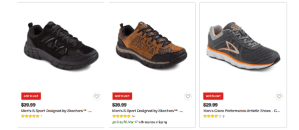
The product list page aims to give users all the information they need to choose a product but not necessarily all of the information required to make the final purchase decision. Product details such as shipping information, full product description, and extra photos are generally found on the product detail page.
Product lists resemble the familiar action of standing in the store aisle and looking at the product offering. Customers have not picked up the product, looked at sizes or other information yet. They are just seeing what specific products are available and noting their prices.
Main Goals:
●Display the products for sale.
● Move people closer to the items they are looking for.

Main Elements:
● Multiple Products with photos, price, name and limited additional product info
● Filters / Refinements
Calls to Action
● Products or product names
● More info button
● Add to cart button
● Links to related content
Urban Outfitters designed their product list pages well. When viewing the product list page for a pair of sunglasses on a desktop computer, a photo of the glasses and a model wearing them alternate when mousing over the thumbnail. Color options—something many shoppers care about—are also displayed. The site provides users with the information they need to make a purchasing decision through a clean, elegant design.
Website Structure / Product List Hybrid:
Some pages include a combination of category and product list elements. These pages move users closer to the products they want in an efficient manner. Which specific elements to place on the hybrid pages will depend on a number of factors including whether the selections follow a long-tail distribution (large number of unique items in relatively small quantities), the number of products available, and the devices that the target audience use.
Website Structure / Product Detail Page:
Product detail pages provide detailed information about the product. Ideally, the page displays everything the customer needs to make a buying decision and determine whether or not the product and offer is right for them.
Main goals:
● Help the shopper decide whether the product is right for them.
● Provide cost and shipping information.
Elements:
● Product Photos, Videos
● Text Description
● Data Grid including Size, Weight, etc.
● Product Guides including PDF Downloads
● Price
● Options
● Availability, Shipping Time
● Add to Cart Button (Call to Action)
● Share or Save to List (Secondary Call to Action)
● Related Products (Add-ons Or Accessories)
● Customers Also Purchased (Secondary Call to Action)
● Reviews
● Trust Signals
Website Structure / Shopping Cart:
The shopping cart metaphor is used in eCommerce as well. Some sites let customers skip the shopping cart altogether and go right to checkout. When a customer is ordering only one item, that is generally fine. If they are buying multiple items at once, it is helpful to see all the products being purchased before advancing to checkout.
Main Goals:
● Show customers what they are buying.
● Give users info about ALL costs including shipping information.
● Display payment methods or link to external payment method.
Elements:
● Product names, quantity, price
● Full price info including shipping and tax (add zip code)
● Ability to add coupons (this can also be handled at checkout)
● Payment method (this may also be handled at checkout, however, third parties such as PayPal often have their own checkout and these methods are selected here)
Website Structure / Checkout:
Main Goals:
● Review the purchase including tax, shipping, and terms before paying.
●Complete the transaction by entering payment and shipping information.
Elements:
● Sign in or guest checkout
● Form field for billing and shipping info
● Form field for payment info
● Shipping options
● Form field for coupons if not added already
● Form field for additional comments
● Place order button
Website Structure / Static Page:
Static pages or general information pages can be grouped in a number of ways. Blogs may also fit into this category and fulfill a number of roles, such as providing product info, company info or other related topics.
Products / category information:
Comparison Sheets
Product Guides
How-To Pages
Company Information:
Contact info, company history, job opportunities, and any other company-specific info
Legal Information
Terms and Conditions
Shipping Policy
Return Policy
Privacy Policy
Website Structure / Customer Account:
The Account section is provided by eCommerce sites for customers to save all user-specific information. Generally, password protected, customers can access it to update payment data, view past orders and find shipping information.
Main Goals
● Provide information about current and past orders.
● Shipping and billing information.
Elements:
● List of past orders to allow for easy reordering
● Tracking and shipping information
● Easy to update payment, shipping and account info
Website Structure / Off-site pages:
These are not pages on a store site but are considered additional pages that the store has some control over. Unlike media sites or review sites that stores do not have control over, these pages allow retailers to add their information such as logos, images, and general store information.
Store brand should be consistent across all touch points and off-site content is no exception.


